
Dyslexia-Based Book Design
Cautionary Tales: A Dyslexia Simulation Book For Adults
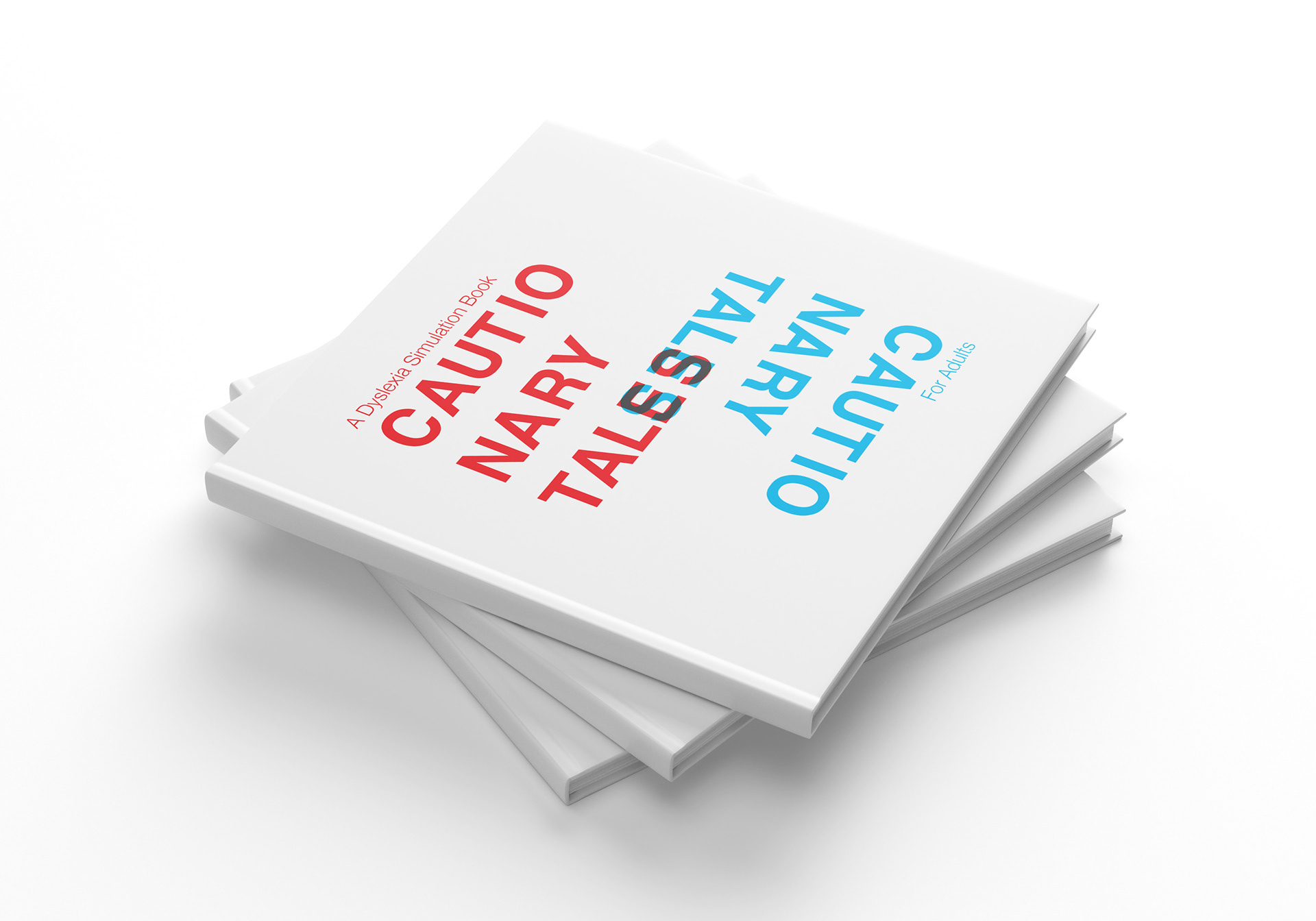
This collaborative project challenged my team to re-design Hilaire Belloc's Cautionary Tales for Children for adults. Our book is aimed at parents and guardians of dyslexic children - the layout, text and illustrations simulate the experience of reading with dyslexia, enabling the target audience to sympathise and better understand any reading difficulties their children may have.
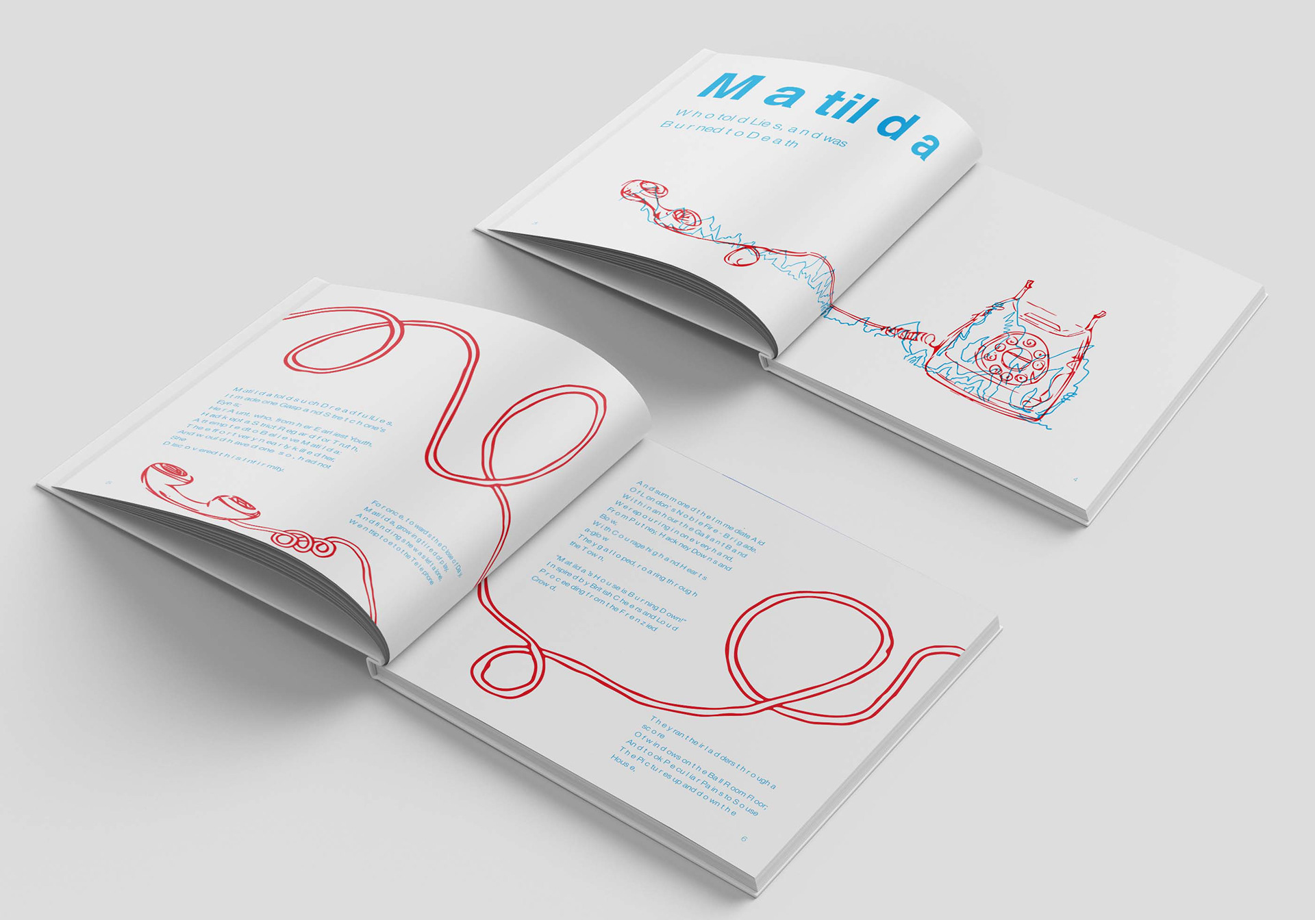
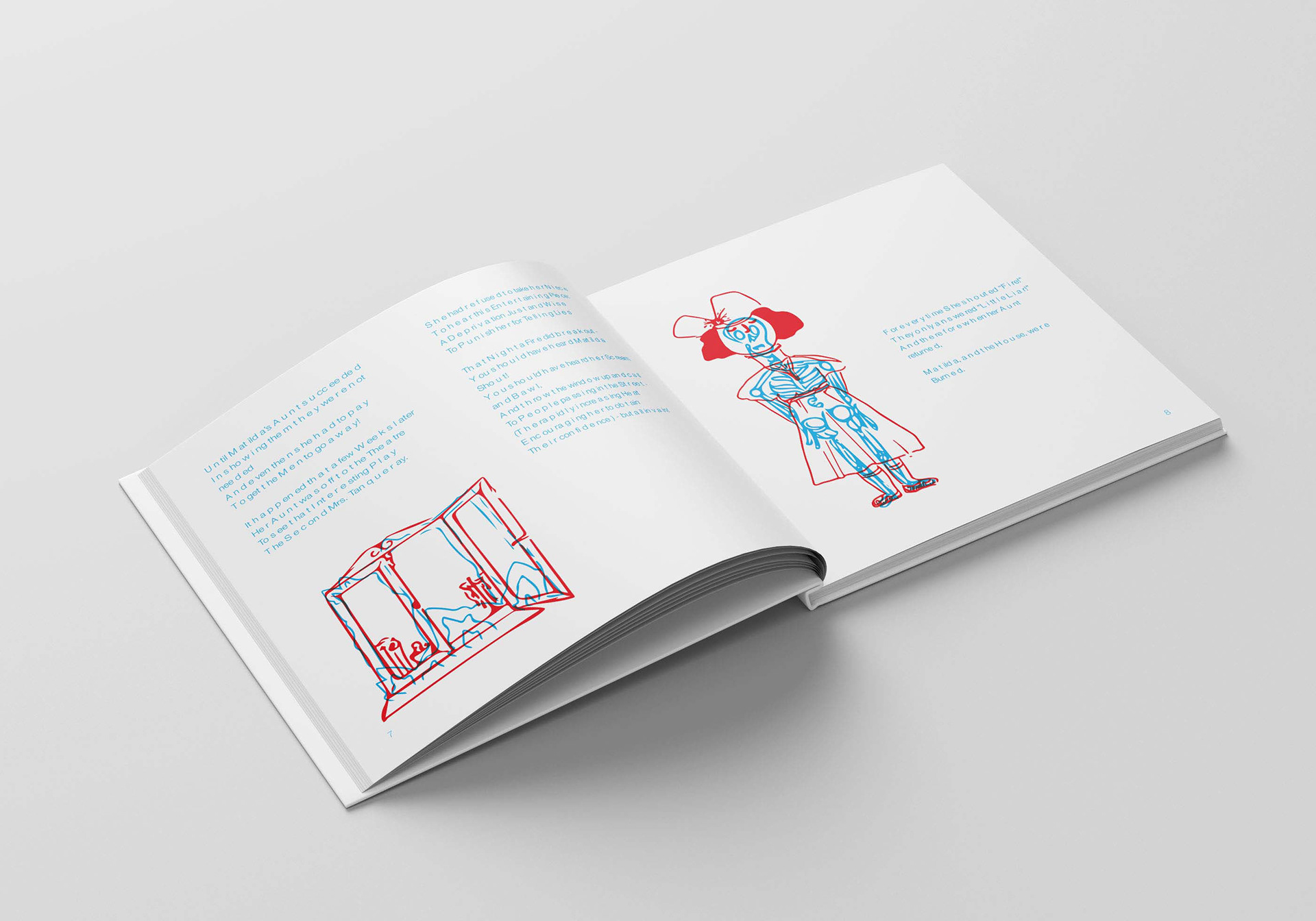
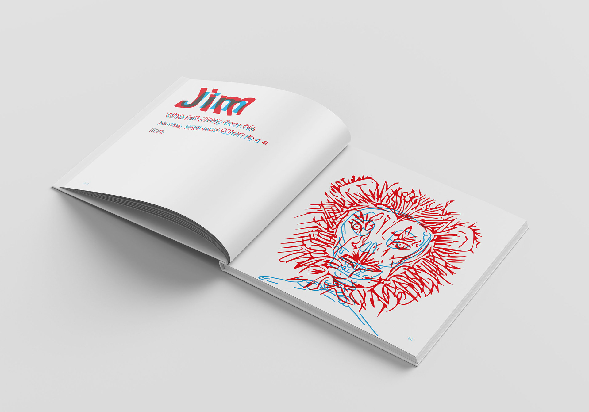
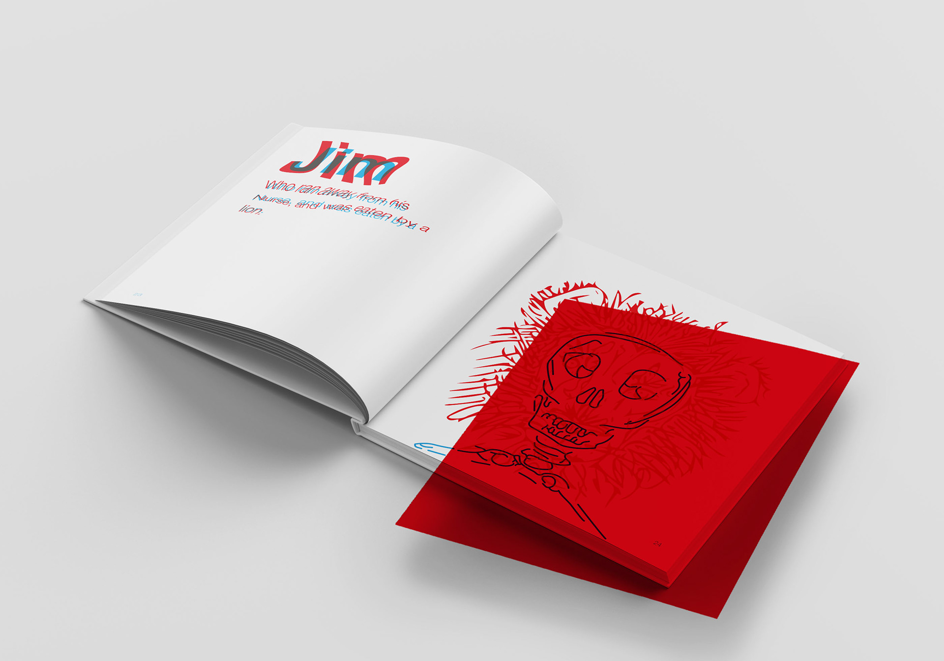
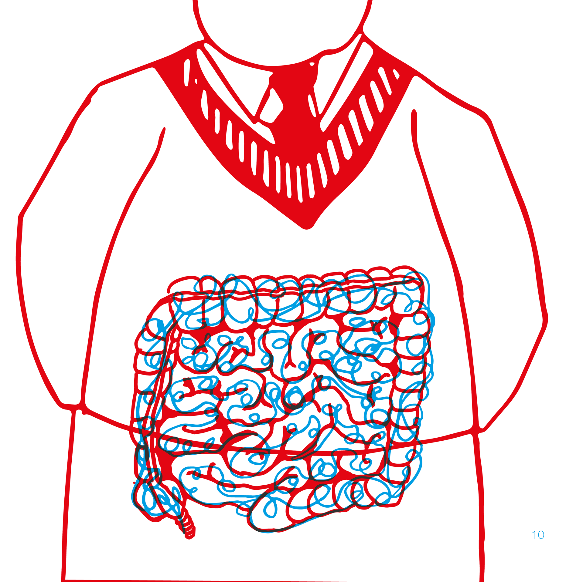
The book uses a red filter to show the contrast between the reading experiences of those with and without dyslexia: when placed over the jumbled text or overlaid illustrations, the filter reveals the poems in plain sight. This idea stemmed from research that suggested colour filters help some people with dyslexia to read more easily by minimising contrast.
I managed the project as acting art director, as well as contributing the overall layout work and typographic decisions for the book. As our book was based so strongly on recreating an experience that varies from person to person, we conducted extensive research to fuel our ideas.
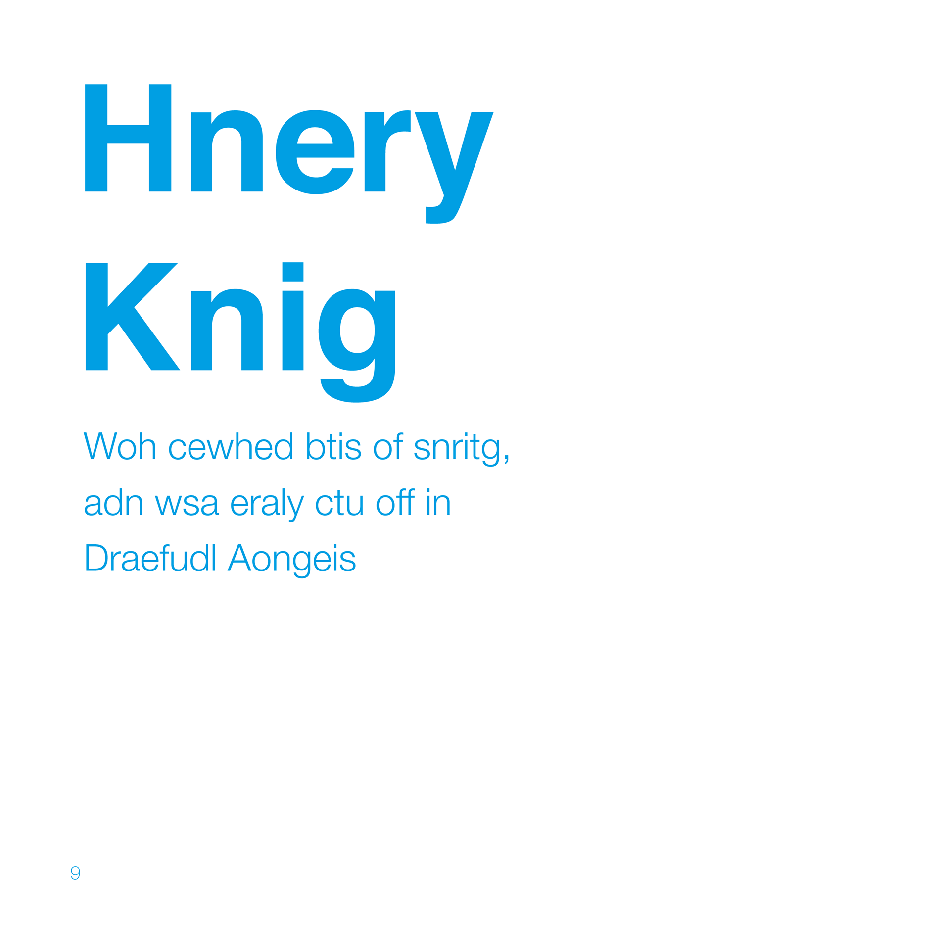
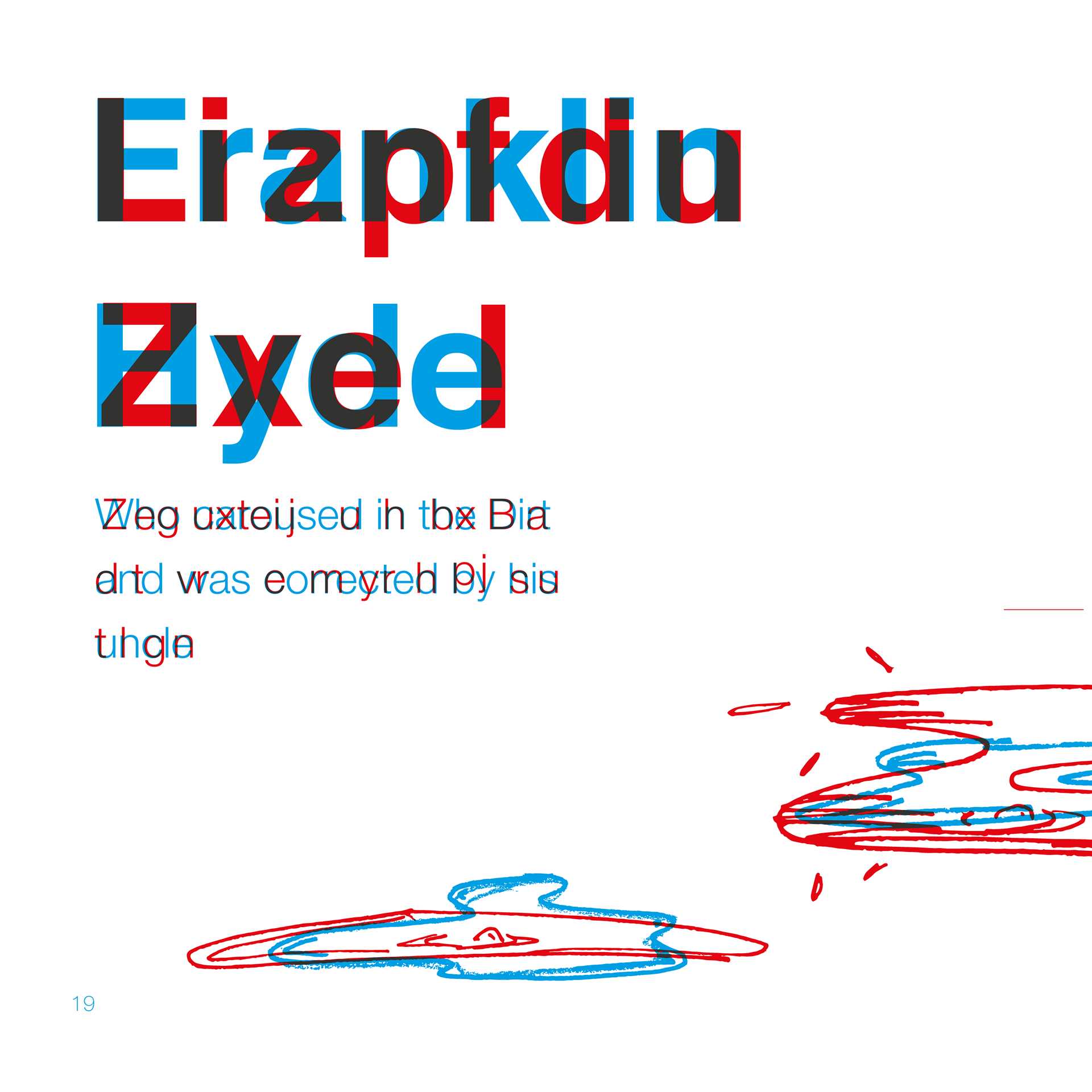
Ultimately, each of the six poems in the book is altered in a different way; these variations stemmed from personal testimonies that we came across, each of which likened dyslexia to reading in a particular way. For example, one described the struggle of mixing up individual letters within a word (see Henry King) while another said they experienced words floating around the page whilst reading (see Franklin Hyde).

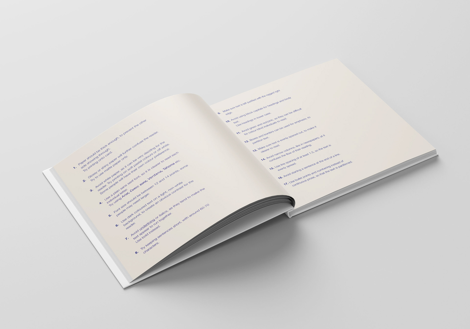
In addition to replicating the experience of reading with dyslexia, a key component of the book is the 'Tips' page included after the Cautionary Tales. This provides suggestions for how to support a dyslexic child's reading and emphasises the influence that design choices have on the ease of reading with dyslexia.